Microsoft really loves rounded corners, and that was clear when they became one of the key “modern design” moves in Windows 11. Now, Edge is getting another major facelift in 2026, and Microsoft sources have told Windows Latest that it’s moving closer to Copilot’s interface. This makes sense, as the Copilot app now ships with a private copy of Edge.
In our tests, Windows Latest observed that Edge’s existing rounded corners are now even rounder, and the effect is visible across the browser. This includes the context menu and even sections inside Settings.
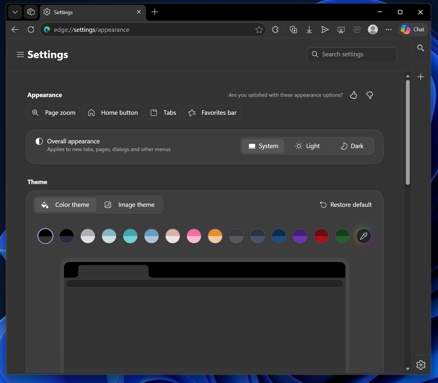
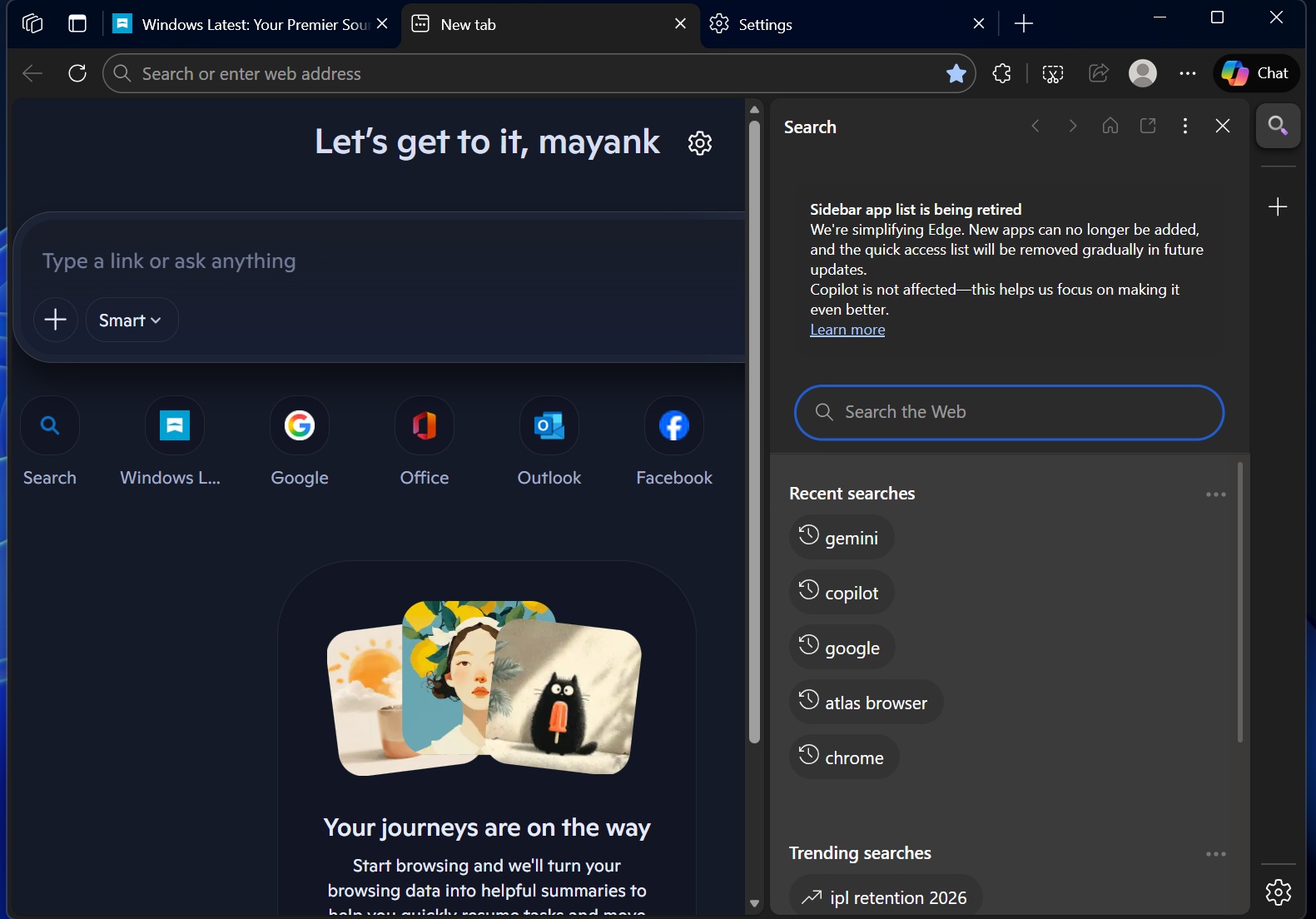
For example, look at the above screenshot from Edge stable. Edge rounded corners are now softer, fuller, and more continuous than the typical Windows 11 corners, which have clearly defined curves at the edges. This new UI approach is similar to a pill design, where curves are stretched to create a softer look, similar to Copilot.
But where is it coming from? Well, if you use Microsoft Copilot, you might have already figured it out. If not, take a look at the screenshot below. It’s the Copilot app for Windows 11, and also the Copilot web (copilot.microsoft.com).
For those unaware, Copilot has been using the same fuller-rounded design for the past several months. Now the same approach is coming to Edge. In fact, it’s being tested in MSN as well.
But it’s not just about rounded corners. I also noticed that Edge has a new design for toggles, such as the one used to enable tracking protection (found at edge://settings/privacy/trackingPrevention).
At first, it might look like classic iOS-style toggles, but if you’ve been using Copilot on the web, you may have already noticed a similar design direction there.
It’s all part of the company’s efforts to bring Edge and Copilot’s design closer, because both are now related to each other in one way or another.
Edge is now superheaded by the Microsoft AI team
All of that might sound vague, but it starts making sense when you look at the recent Microsoft reorg and its new hierarchy.
Microsoft Edge is now under the Microsoft AI team, which also spearheaded Copilot’s recent design overhaul that focused on softer visuals, with rounded corners, iOS-like toggle colors, and a version of dark theme that is easy on the eyes.
Microsoft really needs to bring Edge back to its old glory
I love Microsoft Edge, and it’s still my default browser. I don’t dislike the new rounded-corner design; it does look decent. But Edge no longer feels the same as it used to a few years ago.
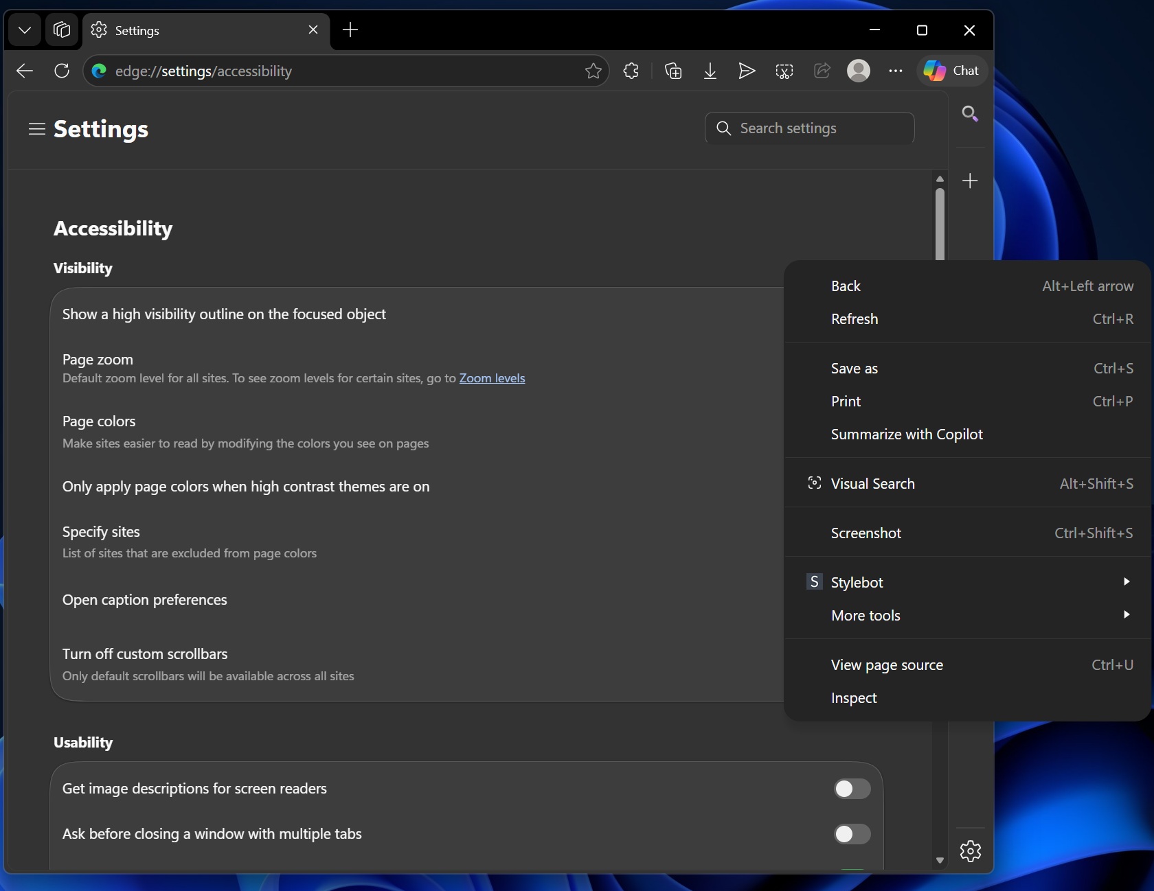
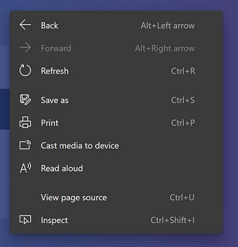
Microsoft Edge used to be one of the best-looking browsers, but over the past several months, it has started to look more like Google Chrome. For example, Microsoft has dropped icons from the context menu:
It doesn’t look like Microsoft is going to stop here. Until now, Microsoft has maintained its own variation of Chromium features, including a picture-in-picture window that used Windows 11-like buttons for media playback controls. Now, it appears that Microsoft might ditch its own Picture-in-Picture window design in Edge for the version used in Chrome.
While that makes it easier for Microsoft to ship all Chromium improvements, it also means Edge would look more like Chrome.
It’s an approach that companies like Brave and Vivaldi, which also use Chromium, have avoided, but Microsoft appears to be preferring this route.
Also, it’s not just about the design, but the features too. Microsoft has removed Edge’s unique features, such as the sidebar that allowed you to access Outlook mail.
Regardless, it is what it is, and Microsoft will continue to pursue the Copilot UI, embrace Chromium, and automatically change your new tab page to open Copilot as part of ongoing experiments.
What do you think about Microsoft Edge’s recent changes? Let me know in the comments below.
The post Microsoft Edge’s new design is starting to look more like Copilot, with softer corners and iOS-like toggles appeared first on Windows Latest