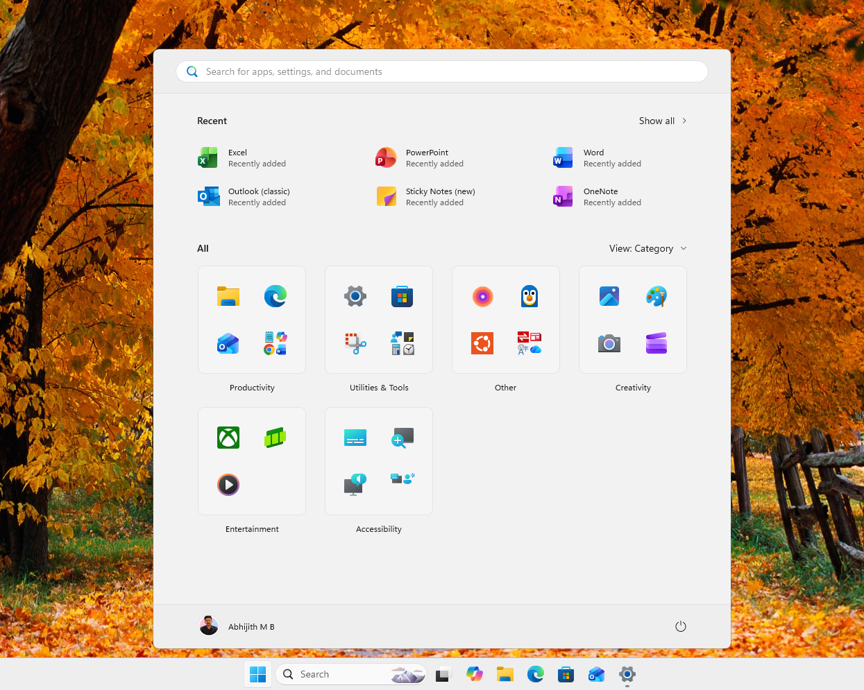
Windows 11’s right-click menu, also known as the context menu, is a cluttered mess, but it could soon change course. Microsoft has confirmed that it’ll let you customize the context menu to your liking, which means you’ll be able to add or remove items.
In a post on X, Marcus Ash, who leads Design and Research for Windows and Devices at Microsoft, confirmed that you’ll be able to customize the context menu. In addition, the right-click menu will load faster and be simpler by default.
“[We’re] working on making context menus faster, simpler by default, configurable to what you use most. More will be shared on our approach soon,” Marcus wrote in a post on X.
A customizable context menu wasn’t on my bingo list, but I am pleasantly surprised at this point, as Microsoft has proven it’s listening to your feedback. It’s all part of the company’s plans to make Windows 11 a better operating system or, in Satya Nadella’s words, “win back” fans by focusing on fundamentals.
Windows 11’s context menu was supposed to improve on Windows 10’s version
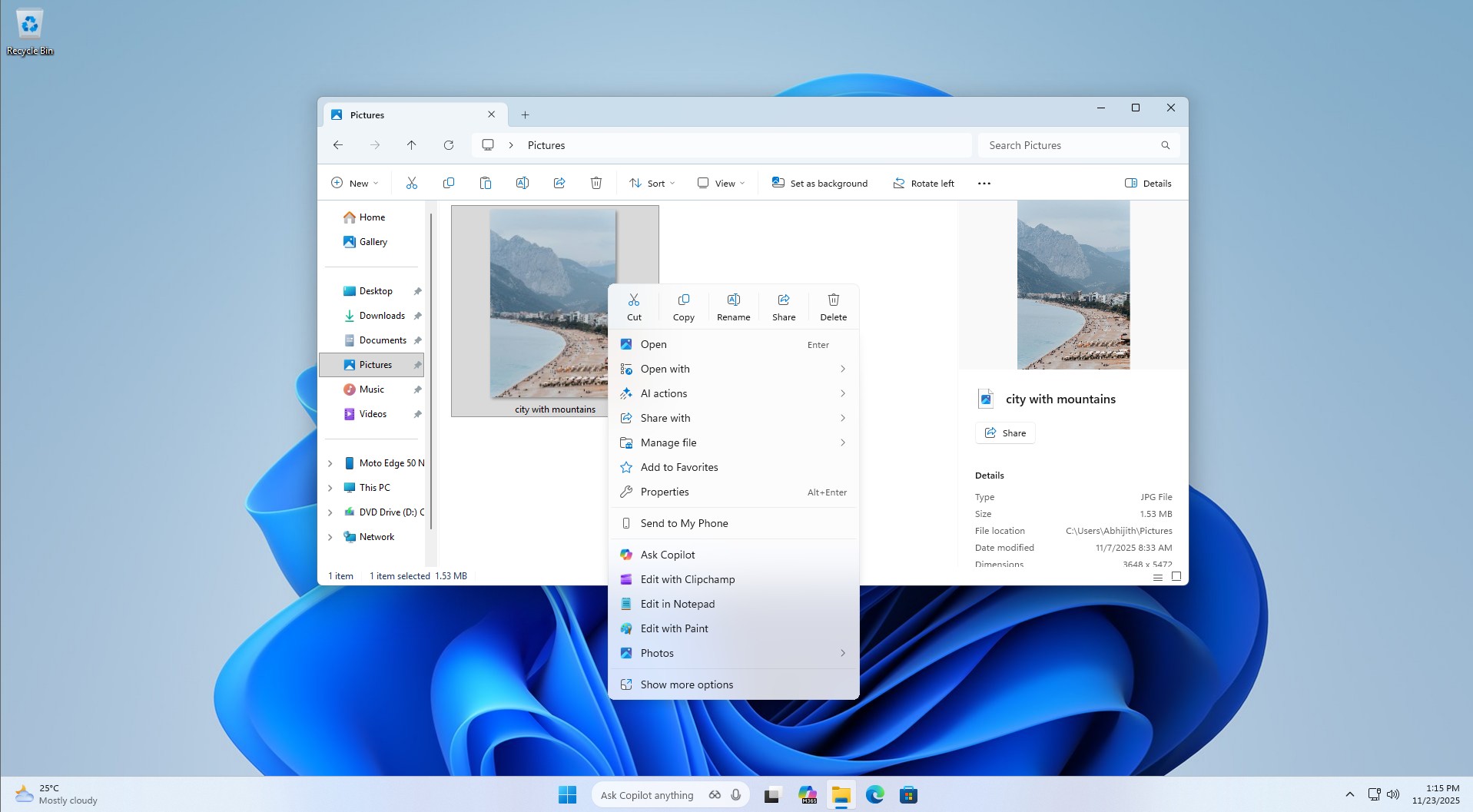
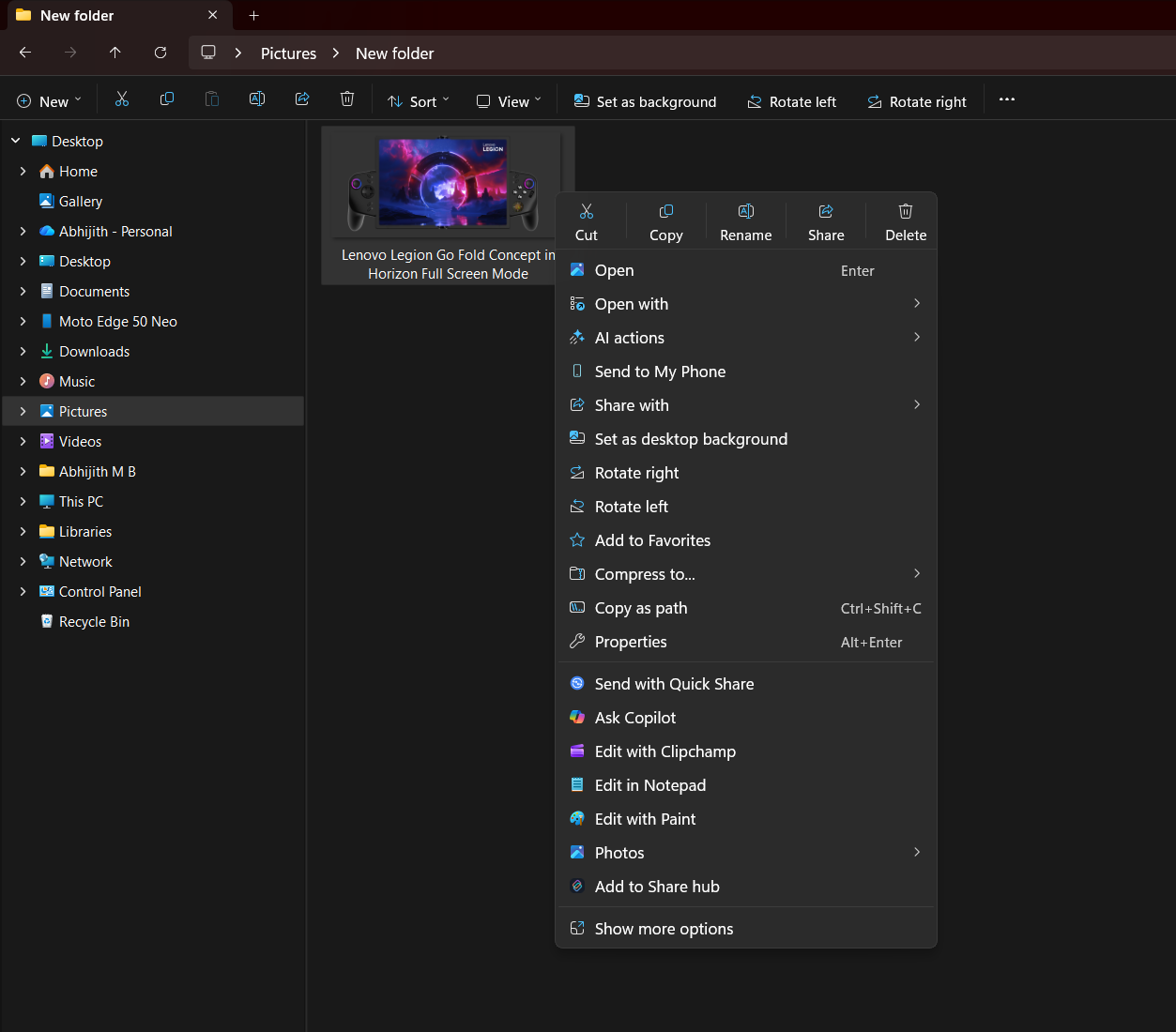
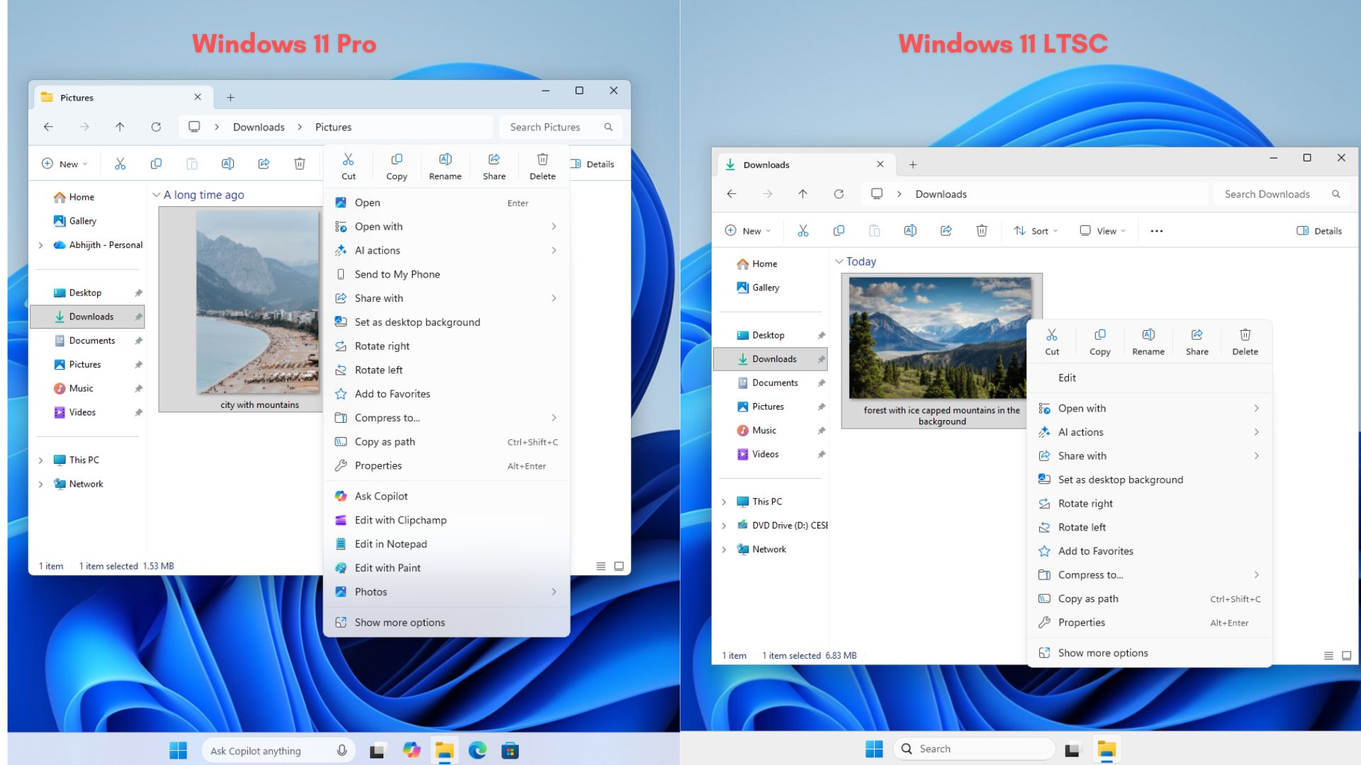
Windows 11 not only replaced the Start menu but also the right-click menu from Windows 10. The new context menu is more modern with rounded corners and a touch of Fluent Design, but it’s not as fast as the Windows 10 version.
Moreover, it can be messy because it sometimes contains too many items, which means it can occupy a huge portion of the screen. It’s quite interesting because Windows 11 was “supposed” to make the context menu less cluttered.
In 2021, Microsoft admitted that Windows 10’s context menu had become too crowded over time, and it’s largely because the feature has “grown in an unregulated environment for 20 years.” It started with Windows XP’s IContextMenu system, and Microsoft never tried to mess with it, which is why more items piled up in the menu.
Over the years, Windows 10’s context menu became very long, and important actions like Cut or Copy were placed far away from the mouse pointer. You couldn’t find what you were looking for, and the poor organization only made things worse, as items like “Open” and “Open with” were sometimes placed far apart.
At that time, Microsoft promised Windows 11 would take Windows 10’s context menu, make it modern, responsive, more organized, and less cluttered.
Microsoft said Windows 11 addresses these problems by placing “common commands… right next to where the menu is invoked,” grouping “Open” and “Open with” together, and moving app-added commands into a more organized structure.
It also promised that “no commands have been removed entirely,” because “Show more options” would still load “the Windows 10 context menu as-is” for older commands and apps that had not yet moved to the new model.
Five years later, Windows 11 has clearly failed to address the major problems. While it does a better job of organizing items and is indeed “modern,” it’s still a cluttered mess. Not only that, but Windows 11’s menu feels “larger” than the Windows 10 variant because of the extra padding it has.
You can always go back to the original context menu via “Show more options,” and some people use third-party apps to make that default, but it’s not the ideal route.

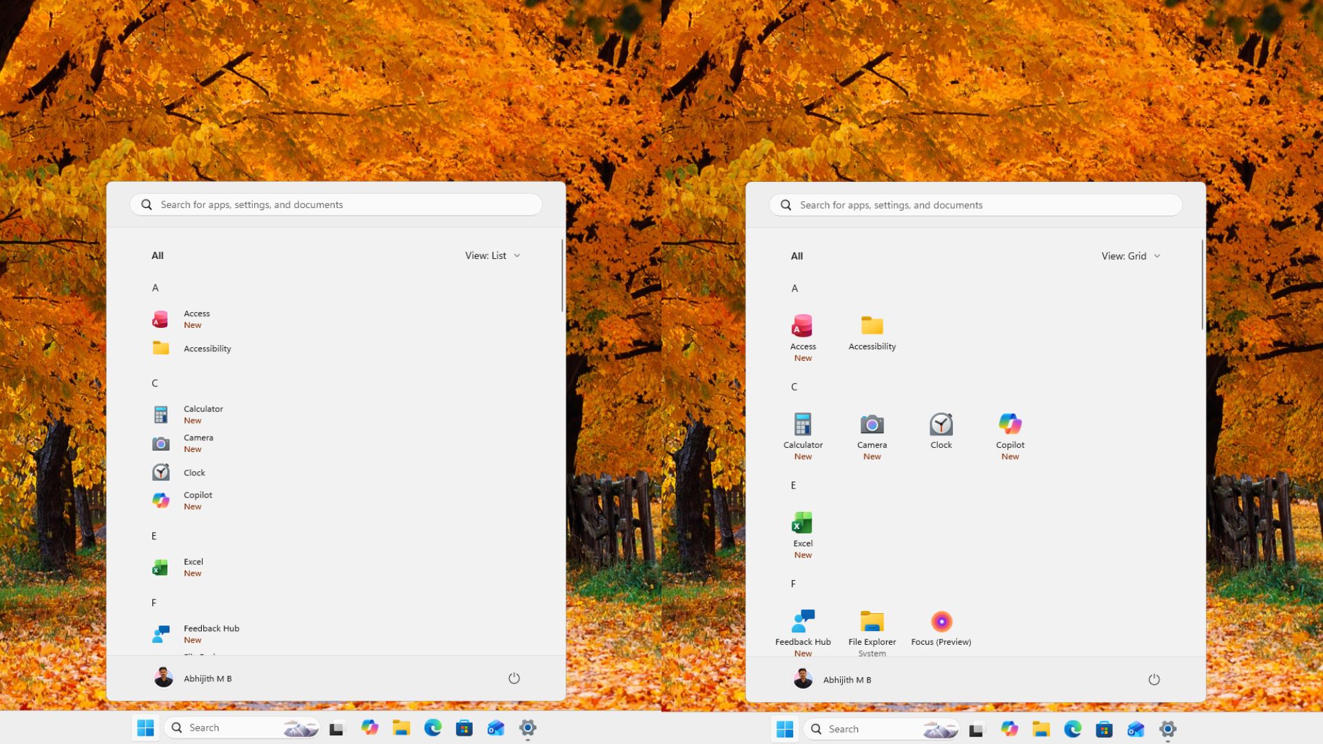
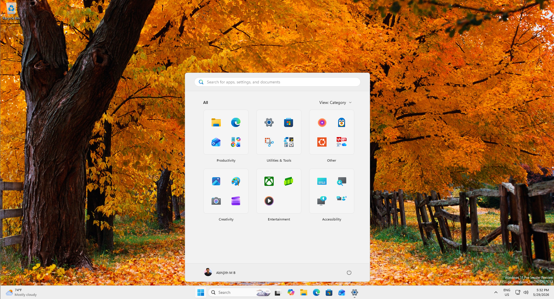
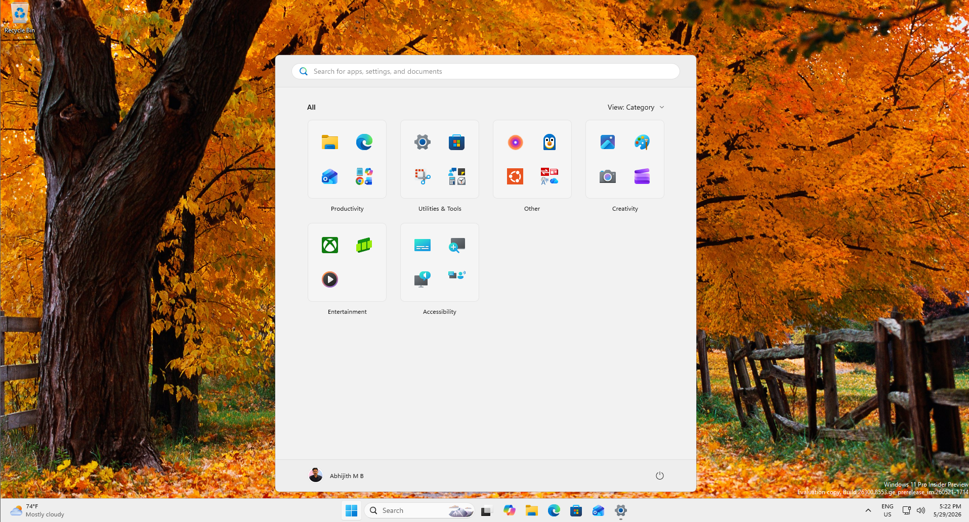
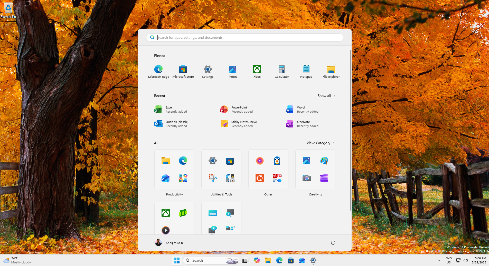
Microsoft recently added the ability to move the taskbar and is rolling out a new toggle that lets you make the Start menu smaller. It’s also testing a modular design for the Start menu, where you can turn off different sections or all sections, including the most disliked “Recommended,” which is being renamed to “Recent.”


The upcoming context menu changes appear to be another part of that greater effort.
What else do you want Microsoft to patch up next in Windows 11? Let me know in the comments below.
The post Microsoft admits Windows 11’s right-click menu is a mess, will let you customize it after years of complaints appeared first on Windows Latest