There’s a new Start menu coming to Windows 11 with an iOS-like Categories feature, and an option to remove the ‘Recommended’ content feed. In addition, you can access Android or iPhone’s content directly from the Start menu, but do you know Microsoft experimented with several radically different Start menu designs before finalising the update?
Start menu has been redesigned dramatically five times since its debut in Windows 95. With Windows XP, Microsoft added a two-column layout. Then in Windows 8, Microsoft replaced static icons with live tiles, which were improved on Windows 10, but killed with Windows 11.
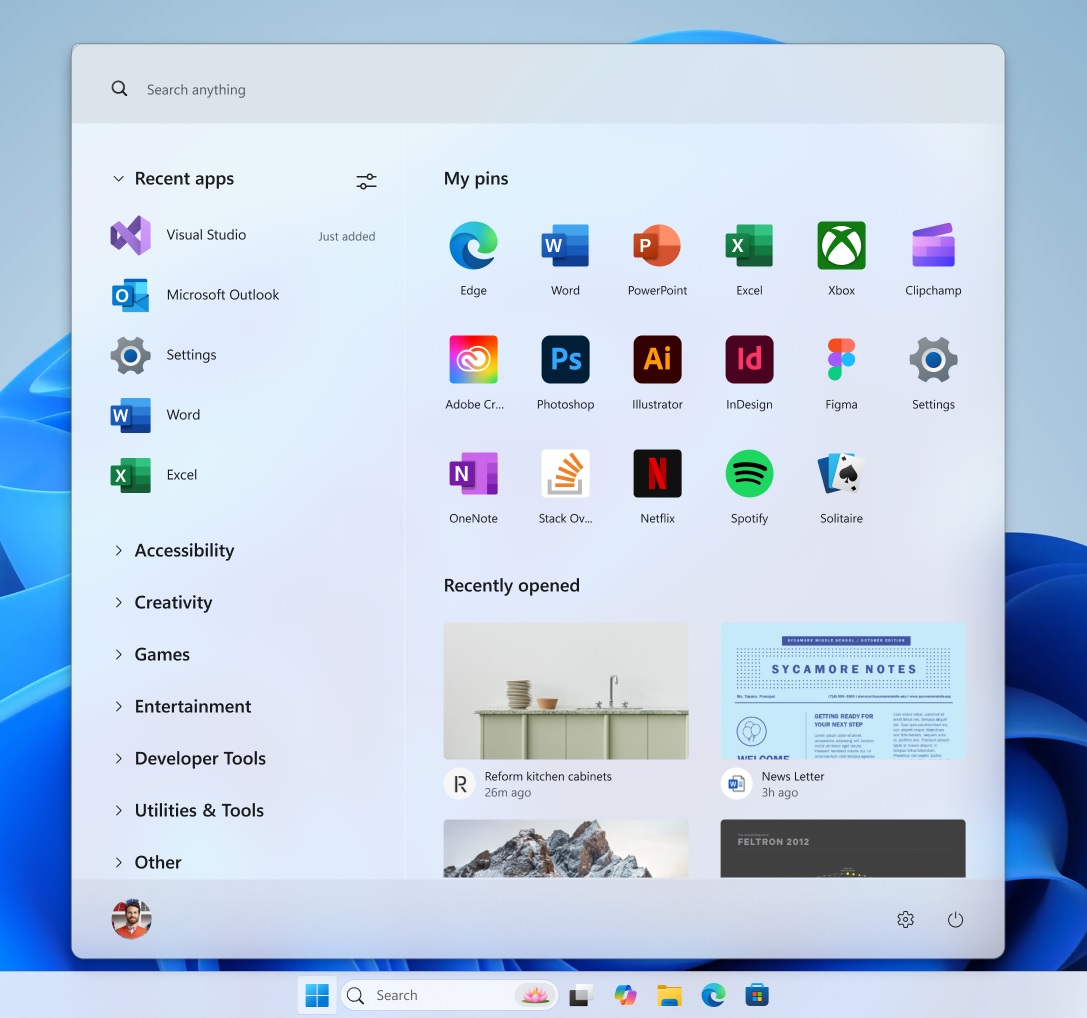
Microsoft still believes Start is where you start on Windows 11, and it’s true, especially when you use a lot of apps. Windows 11 has a centered and minimalist Start menu that some people like, and others hate it because they either prefer the Windows 7/XP style or the Windows 8 tile.
What does it take to design a Start menu? Feedback, calls, and coffee
Windows 11 Start menu is decent, but there’s always room for improvement, right?
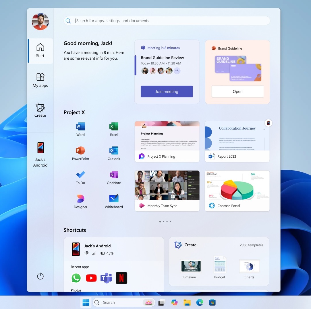
Based on Feedback Hub notes, remote interviews with passionate Windows users, and “coffee chats” at the headquarters, Microsoft finalised this new design for the Start menu:
It will begin rolling out to everyone in the coming weeks.
I’ve been using the new Start menu for over a month on my test machine, and I do find it better than the current version. But why was this particular UI finalized, and what were the other potential candidates?
Microsoft learned from users that they want to find the installed apps faster, and “bend Start to fit the way of work.” I am not sure what is even meant by “Let me bend Start to fit the way I work,” but I assume it’s related to the customization capabilities, such as turning off the Recommended feed if you don’t need it.
This Start menu was designed on the following methodology:
- 300-plus passionate fans. Microsoft says it asked for “feedback” from each one of the fans.
- Co-creation calls helped Microsoft designers understand user feedback for every area of the Start menu.
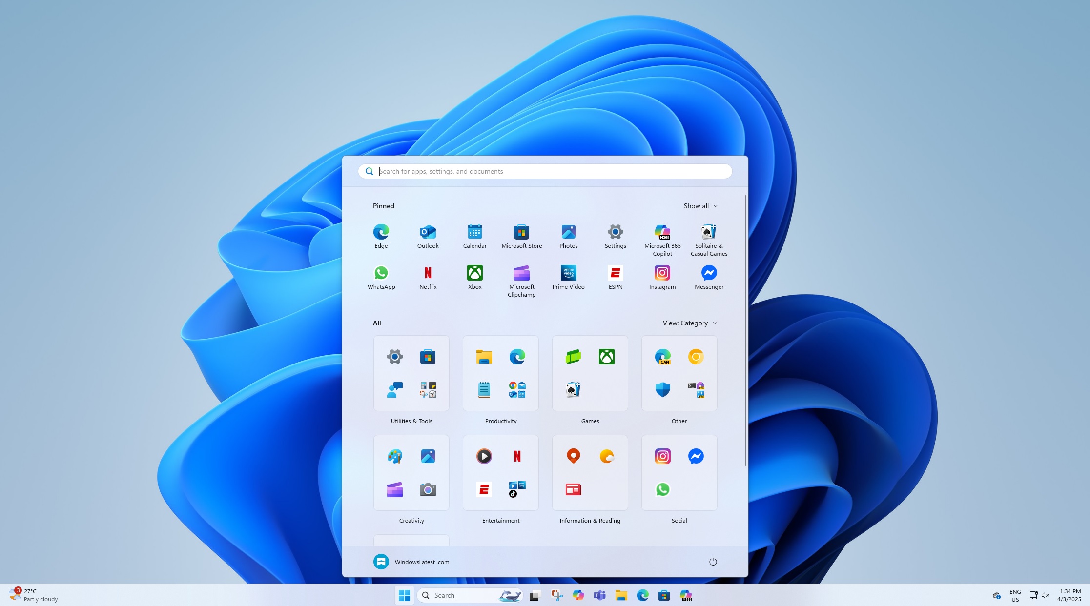
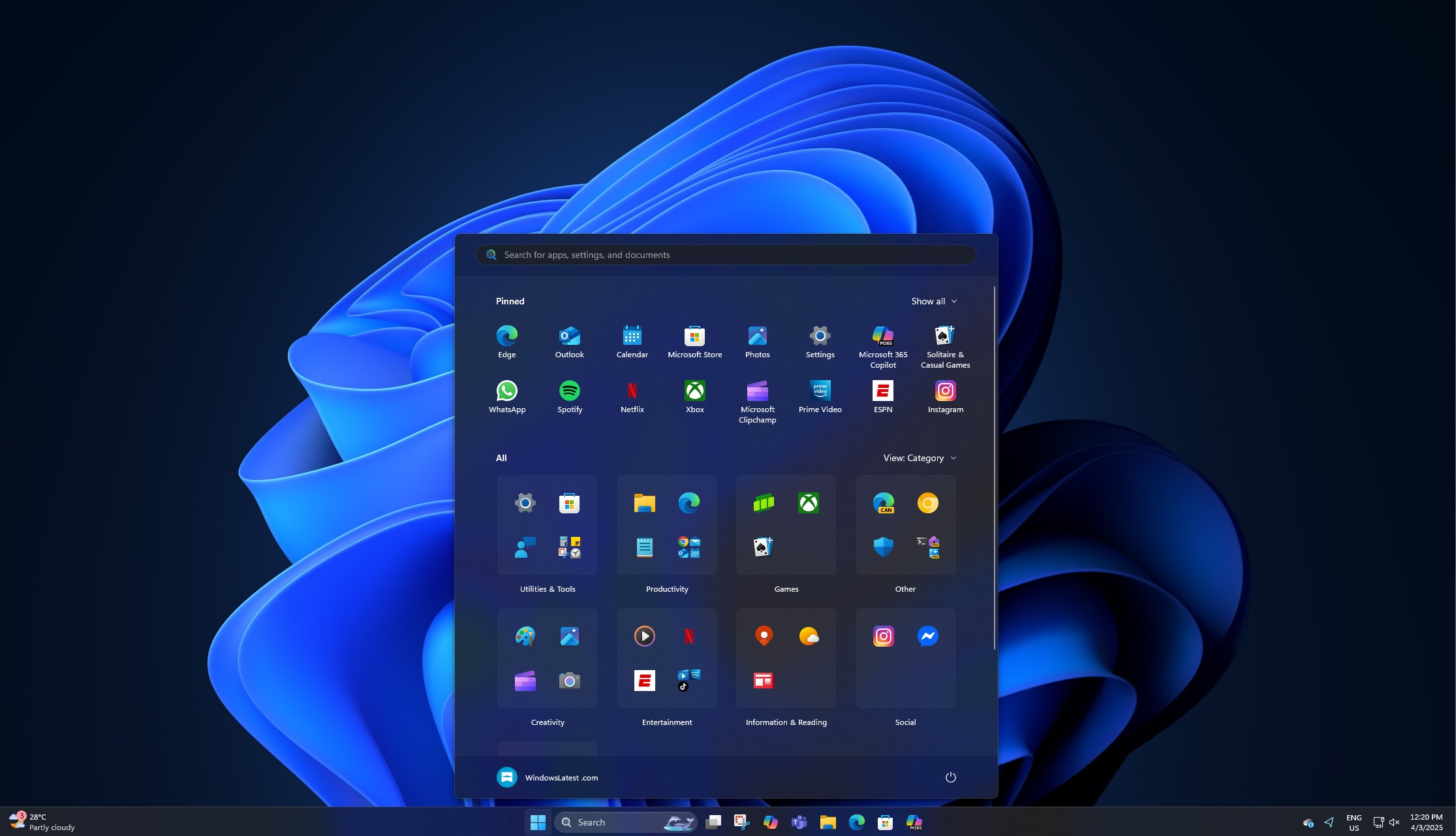
Finally, Microsoft locked the above Start menu refresh because it met the user requirements and looked great on a 49-inch ultrawide PC as well as a Surface Go (10-inch).
But it wasn’t the only Start menu idea the company explored.
We found some of the other designs considered by Microsoft for the Start menu, but remember that they won’t ship on Windows 11. These Start menu designs are official concepts explored internally:
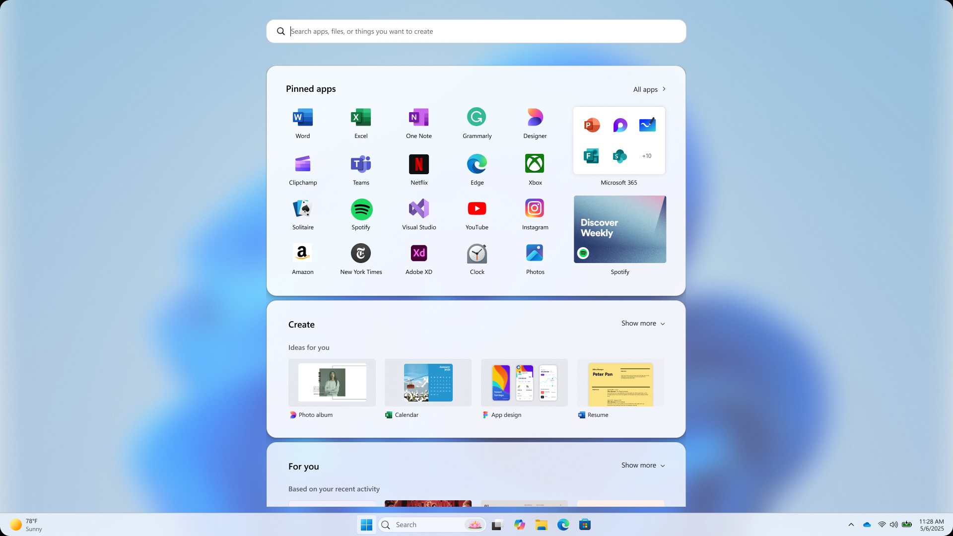
1. A Start with ‘For you’ tab and Copilot | Official Concept
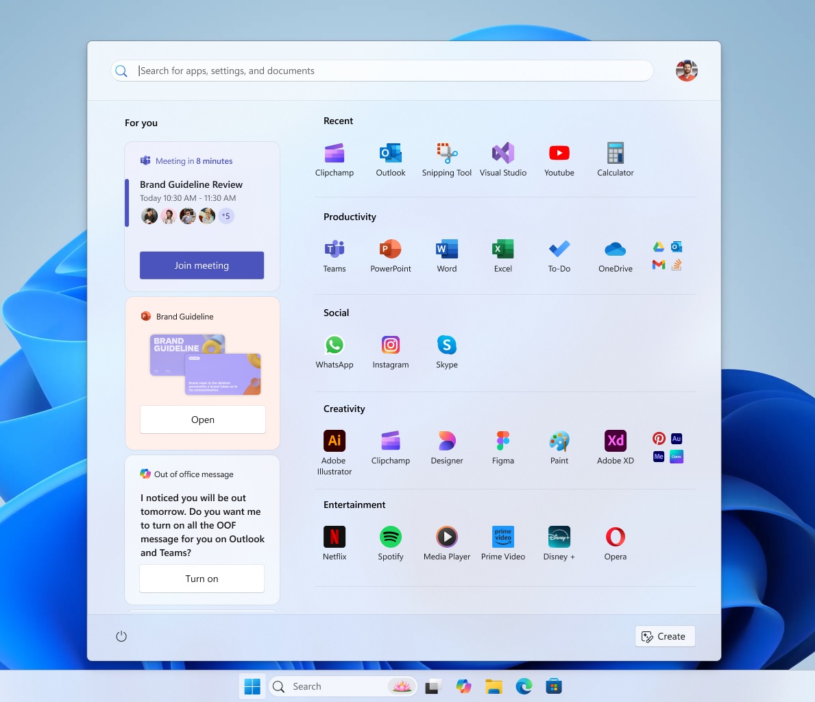
This is one of the first designs explored by Microsoft designers. There’s a “For you” tab, which lets you peek at Teams, PowerPoint, and Copilot-based reminders. Then you have all your apps grouped under different categories.
This design isn’t necessarily bad, but it defeats the purpose of easily finding apps, as the focus is clearly on the “Create” button and Microsoft 365 services. It was ultimately cancelled.
2. A Start menu Live Tiles-like widgets | Official Concept
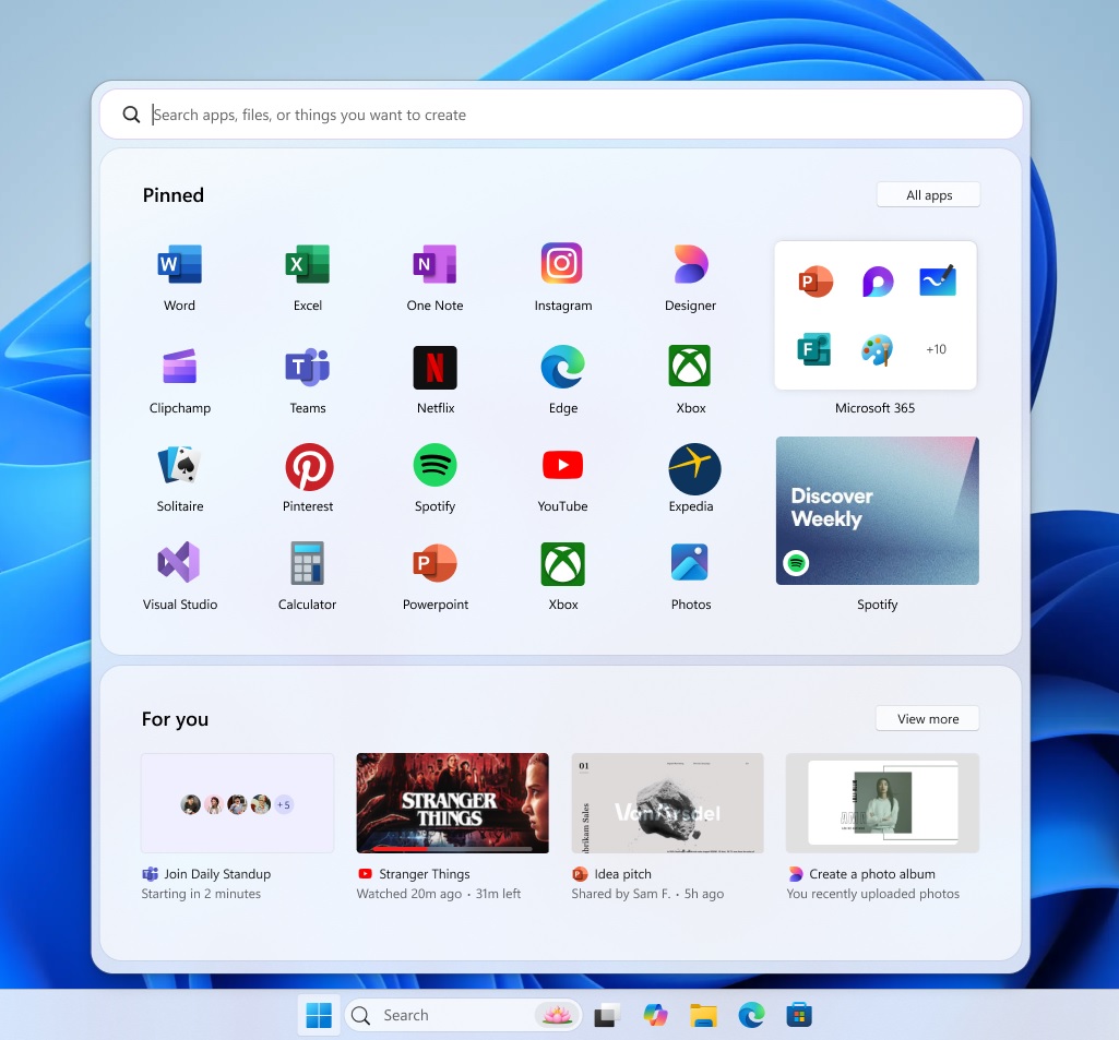
This one is somewhat better than the first concept, but Microsoft designers have tried to integrate ‘widgets’ here, which unsurprisingly look similar to live tiles. I mean, look at the Spotify widget. Does it not remind you of live tiles?
3. A tall, cluttered Start menu | Official concept
What even is concept number three, Microsoft? I’m glad it’s not shipping and was never considered a final candidate. It’s terrible. Cluttered and confusing. It tries to do too much at once, and there’s no clear focus.
Thankfully, the idea was immediately dropped.
4. Start menu that just doesn’t make sense | Official concept
5. What about a full screen Start menu? | Official concept
Microsoft also explored a full-screen Start menu, and it’s one of the designs that I actually like.
While it would look terrible on a desktop, it’s decent for a 10-inch touchscreen tablet.
By the way, do you notice that all these ideas have ‘widgets’ and a ‘Create’ tool? I wouldn’t be surprised if something similar gets added to the Start menu in the future. It’s almost like the idea of integrating Widgets and Create was dropped at the last moment, because every other candidate had these two elements.
What do you think about these Start menu design ideas? Which one is your favourite? Let us know in the comments below.
The post Microsoft shows off radically different Start menu in Windows 11, but it won’t ship appeared first on Windows Latest